Onboarding Redesign: Mahir Digital Bersama Google
Mahir Digital Bersama Google is part of Grow with Google, which connects with small and local businesses in Malaysia to gain the tools and transition their business to adapt to an online space.
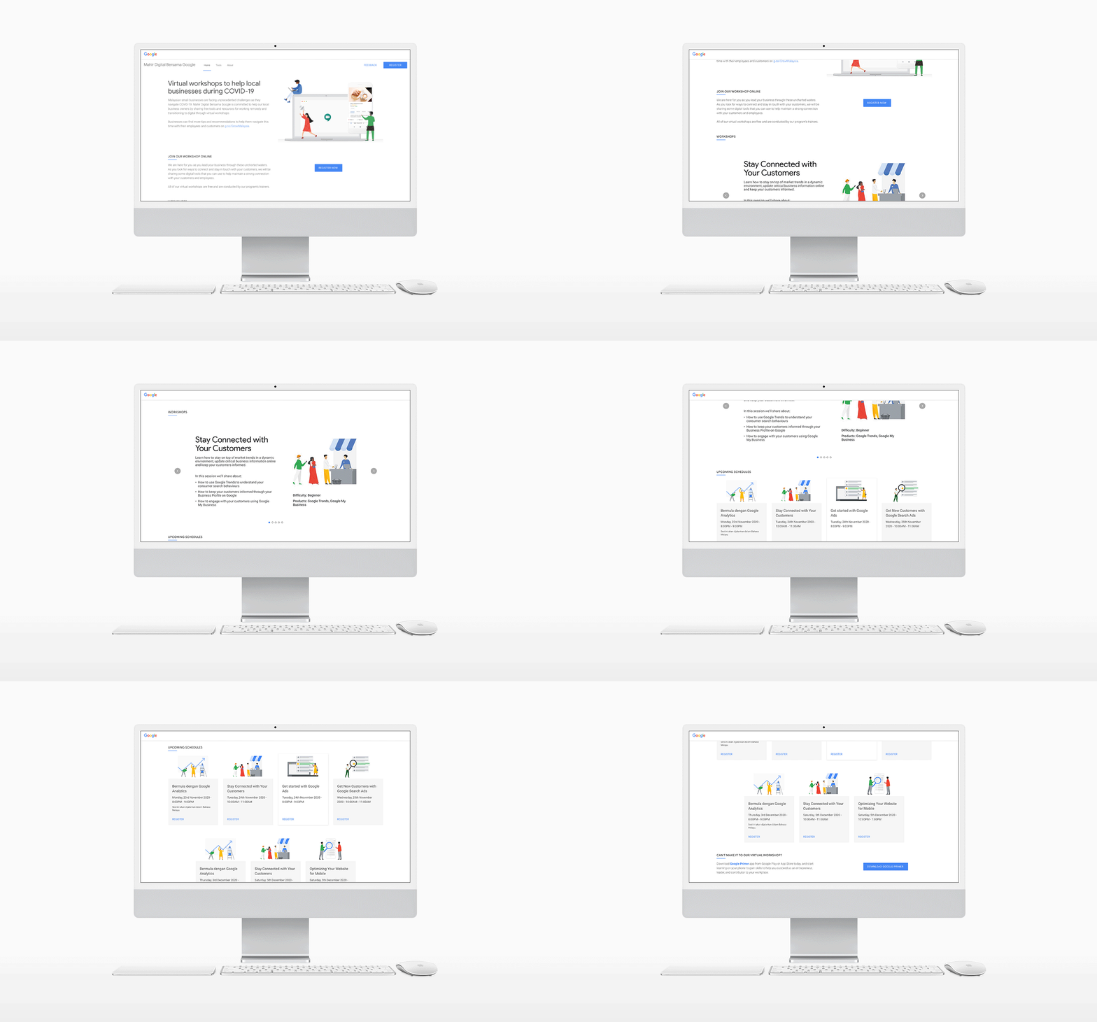
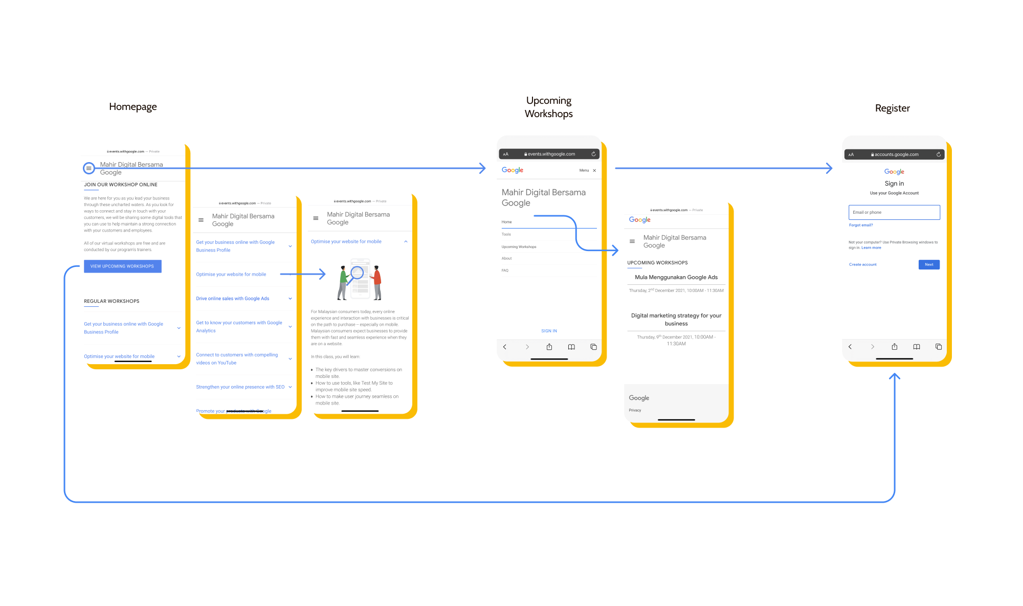
I worked on redesigning the registration site; which included developing a new user flow that has tailors the experience for both new and returning participants, and allowing users to learn more about the workshops available and registration procedures in the process.
Problem Statement
The current ads that ran on Facebook had received a high number of engagement through clicks, but did not reflect upon the conversion rates in registration. I worked to understand the current user pain points by running a site audit and feedback from users.
I analysed some of the common pain points by navigating through the website while auditing and through the feedback that we had collected from the end of each workshop and identified the following takeaways:
Not Optimised for Mobile:
Majority of participants visit the site through clicking on Facebook mobile ads.
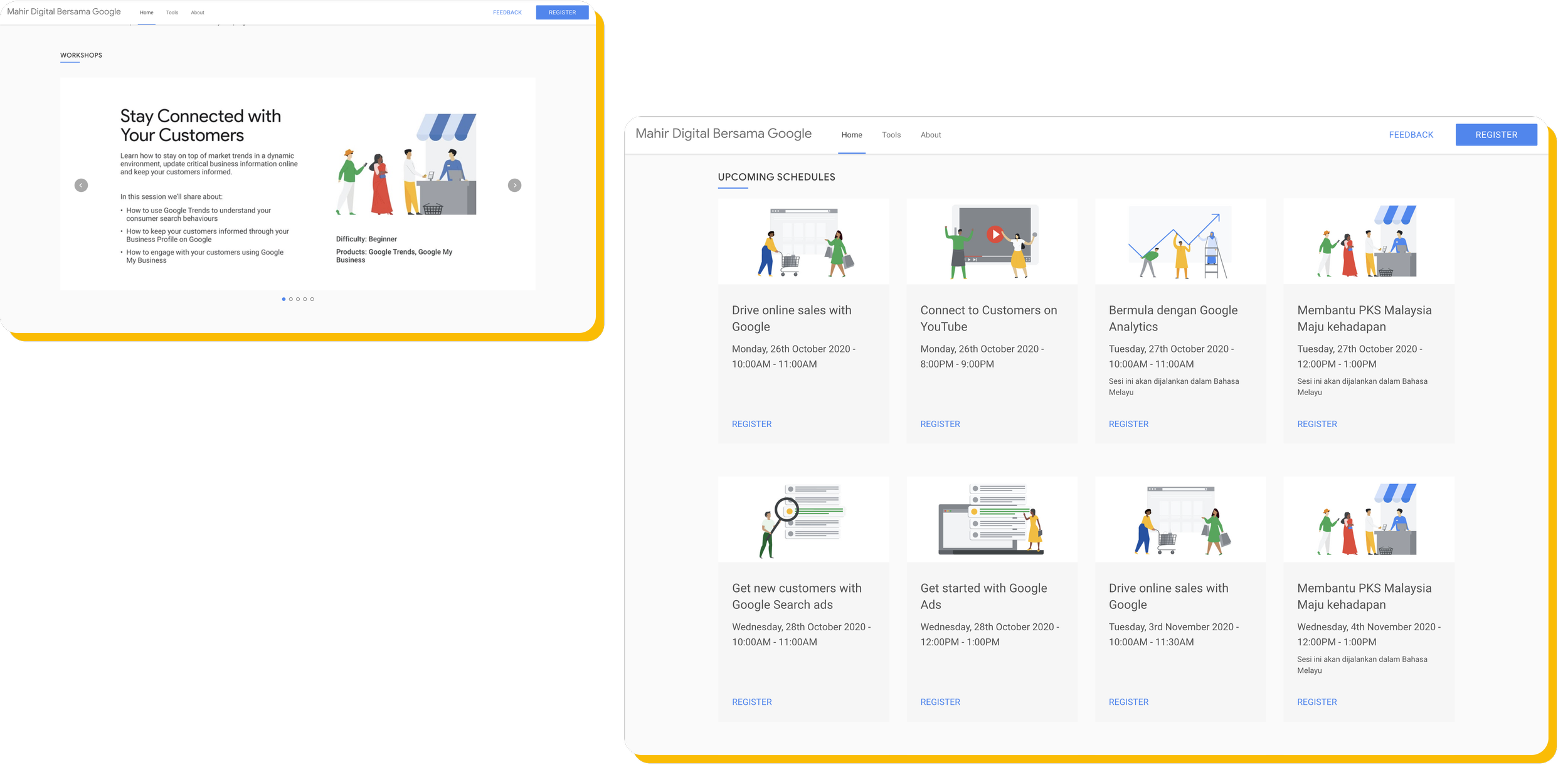
The current site had carousels and a card layout system which were not optimised for mobile; the carousel would get cut off and the card system created an “endless scroll”
Redundancy in user journey:
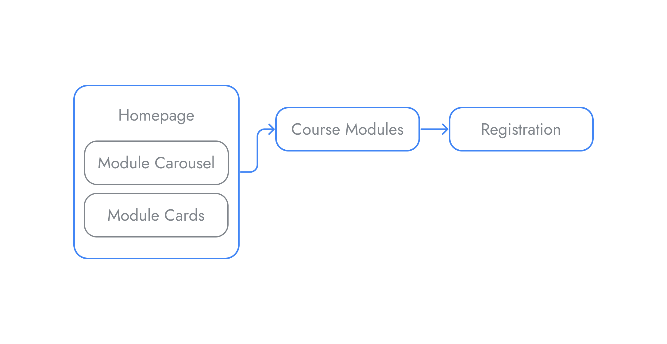
All CTA’s take the users to a single registration page, which creates a repetitive process as they must browse through the available workshop dates, only to have to be brought to the registration page and repeat the process of searching for the workshop date upon registration.
Insufficient context for user:
The current site lacked clarity in explaining the courses, and had outdated information or lacked information of newer courses. This resulted in a confusion when users attempted to register for a workshop.
Original User Flow
Synthesis
Based on the responses, the aim moving forward with the project is to design with a mobile first focused site, as most users are viewing primarily through their mobile devices, tailoring the user journeys for both new and returning users, and to provide sufficient information, but displaying it in a way without overwhelming users.
First Iteration Flow
First Iteration
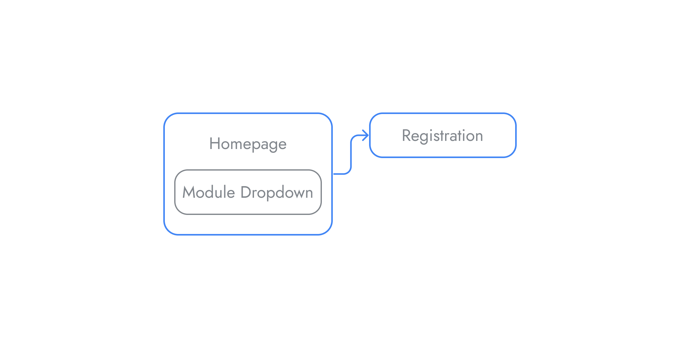
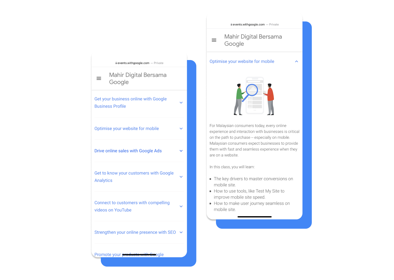
The card and carousel system is removed and replaced with a dropdown menu of the modules. The dropdown menu is more mobile friendly, displaying more modules in the screen space and allowing for a more detailed overview of individual modules. The user experience becomes more tailored as users can choose which module they are interested in.
First Iteration Feedback
After the first round of iteration, the removal of the cards displaying the workshops created a new set of problems. The intention of removing the cards was to streamline the user journey and push forward into the registration process. The issue that developed from the removal of cards is a hesitation to click the CTA to register.
There was a lack of information provided to move users forward to the next step with confidence; without knowing what dates are available before the registration, users felt they would be wasting time to attempt to register only to discover the workshops do not work with their schedule.
Final Iteration
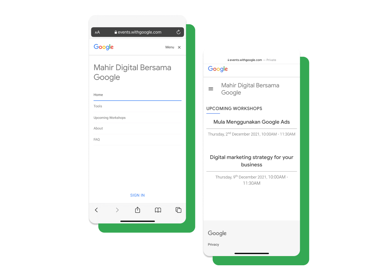
Addition of “Upcoming Workshops” tab:
The addition of the Upcoming Workshops tab provides more information to build confidence in unsure users to proceed to the final step in registering for the workshop modules. The page is arranged by module and workshop availability for a clearer layout, as before modules were displayed chronologically which caused issues in not only searching for the available date but also in search of the interested course.
Unique user journeys:
First time participants have the option to browse the modules offered and and look at the course list, while returning participants interested in the other modules could decide to look through the Upcoming Workshops tab or go straight into registration; users now have the agency to decide how they want to navigate the site so they can gain just the necessary information they seek to register.

